Showing posts with label Modern Mehndi. Show all posts

Monday, March 16, 2015

Happy Birthday and Gorgeous Day


Hello and happy Monday.  I've got a quick post with 2 cards I made yesterday.

First up is a card inspired by the sketch at CAS(E) this Sketch #114.   I used Modern Mehndi stamps and Stitched Rectangle Dies, both by Lil Inker.


A lot of masking on this card.  After my stamping, I used Distress Markers to color only the flowers that were meant to be the top layer, and then cut and popped up my center panel.

I am also entering this card at Lil Inker Monthly Meet Up Challenge.


My next card uses a small flower from Hero Arts Blossom art.  I colored the flowers (and tried to shade them) with Copic markers, doodled a bit on the centers, and then coated them with Wink of Stella.


Here is how I did it.  I started with a single piece of cardstock cut to 4 1/4 by 5 1/2.  I stamped the three flowers that I wanted popped up in grey.  I stamped them exactly where I wanted to put the popped up flowers.  Then, using black Memento ink, I stamped the flowers that would not be popped up and colored them.  I could see where the other flowers would be adhered, so I only needed to color the middle sections of these flowers.  I stamped 3 more flowers on scrap cardstock in black, colored and fussy cut them out.  I fussy cut along the top of the flowers stamped on my card front, attached the three popped up flowers and then adhered the entire panel on to a card base, which had a piece of green patterned paper adhered to the top.

I am entering the following challenges:  A Blog Named Hero Bright and Bold, Color Throwdown #333 (just squeaking in), and Fusion.


Thanks for Visiting

Sunday, February 15, 2015

Weekend Recap


Happy Sunday.  I hope everyone had a very nice Valentine's Day.  I am posting 4 cards I made over the course of the weekend.

First up might just be my favorite, but I'm not sure.  I was inspired by this beautiful inspiration card at Time Out.  I made a pretty literal CASE because I could not see any possible way to improve on this card.  My twist is to have a black card front, underneath my white diagonal stripes.


I am entering this card at Time Out #24, Lil Inker Designs Monthly Meetup Challenge, Colour Me #58, and Simon Says Monday Challenge Red & Pink.


I was inspired by the sketch at CAS(E) this Sketch #110 for my next card.  I masked the flower to stamp the leaves, so I am also linking up at Addicted to CAS where the challenge is MASK.  


I am also linking up at A Blog Names Hero Small Scale, as I kept my stamping to a small section of my card. 


I finally used one of my new Simon Says Stamp dies--Mod Circle Frame--and made a birthday card using the colors from this week's Color Throwdown #329.  I am also linking up at Addicted to Stamps #131 Anything Goes and Seize the Birthday (without toppings).


Last up is a valentine to put away until next year.  I like to have valentines that are not too lovey dovey and more appropriate to send to friends.  I used a die of hearts set in the shape of a heart, and I stamped some newsprint underneath and randomly filled some of the open hearts with red.  The die cut word is from Wet Paint Cuts.


I am linking this one up at ColourQ #279.


Well, that's it for me for today.  I've got to get my big mess all cleaned up to make room for some new goodies I plan to order tonight when PTI's February release goes live.
.

Thanks for Visiting

Tuesday, January 21, 2014

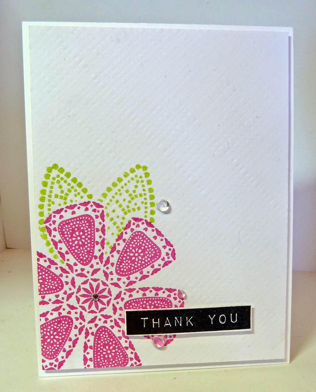
CASology Week #79: Contrast


Welcome to Week #79 at CASology, where the cue word is CONTRAST.   Our sponsor this week is My Creative Classroom.   This week's winner will receive a free seat to any online workshop class.  

There are so many directions you could go with this word.  I started thinking about the contrast between black and white and color.  Lately, I've been playing around with this idea--using color in small doses for greater impact.

I used an image from Lil Inkers Modern Mehndi that had a lot of detail.  I am loving this Mehndi set right now.  I stamped my sentiment and one of the flowers (the one I knew I would color in).  Then I masked that flower and stamped and masked all the way up and around that corner of the card.  I very carefully colored just that one flower in with Copics, ran that panel through my big shot with the PTI Canvas/Linen Impression plate, and then added black Ranger enamel dots to all the flower centers.  I used a raised panel on a base rather than a one layer card because my Copics bleed through the PTI card stock.


As a reminder, here are some points from the CASology blog to keep in mind when you are creating a card in the CAS (clean and simple) style:

1.  One main image
2.  Lots of open space--uncluttered
3.  Limited layers and embellishments
4.  Quick and easy to recreate (note--it may take a long time to get a design you like, but once you have that design, making more should be a piece of cake)


Just for fun, Melissa challenged us to make another version of our card that is not CAS.  Ouch--that was a very hard assignment for me.  I had to do the opposite of all those things above, and I will tell you that it was painful.  I thought I would end up with a huge mess.  I have tremendous respect for those of you who can create layered  and highly embellished  creations that are cohesive and beautiful. 

I used the same stamp set, but you can see a very different card.  Lots of die cuts and layers, no open or white space at all, 2 types of patterned papers and a bow.  Now, I am actually happy with this card, although I would say that the first card is more my style.  Any one of these design elements might find their way onto one of my CAS cards, but definitely not all of them at the same time.


Here they are together:


Check out the beautiful designs from the CASology Design Team members and see how they were inspired by CONTRAST.  Then, please play along and link your creation to the CASology blog by Sunday, January 26 by 4PM (CST).    


How will you be inspired by CONTRAST?


http://casology.blogspot.com/


I can't wait to see how you are inspired by CONTRAST.

 
Thanks for Visiting

Tuesday, January 14, 2014

5 Cards


It seems like forever since I've been able to play along with Muse, so I was happy to have some time and an idea for this week's challenge.  I fell in love with the inspiration card.

Muse card byTherese Calvird

I was inspired by all those vividly colored cupcakes all snuggled up together.  I knew I wanted to something that involved masking and coloring.  I decided to use the paintbrush image from Friendship Jar Fillers, and I stamped and masked it repeatedly across the bottom of my card, and then colored just the paint part with Copics and then Wink of Stella.


My next card is for this week's ColourQ cQc #224 challenge.  I used a layout that I see Deanna use a lot, and I have always loved.  I don't have all of these colors--I had to substitute Soft Sky for Pool Party, and PTI Pure Poppy for Poppy Parade.  I stamped my flowers and leaves in Versamark and heat embossed in clear.  I stamped my Soft Sky background strip with Soft Sky ink on Soft Sky paper.


I made these next three cards yesterday.  I am trying to convince myself that I don't need to order any PTI from this month's release.  If I can restrain myself, it will be the first month in about 3 years that I don't order on the 15th.  I thought I would CASE a couple of the DT samples to prove to myself that I don't need these new stamps.  Wish me luck.  

This card was cased from this card of Nicole's--6th one down.  I used Strawberry Slush and Tempting Turquoise because I was planning on entering this card at Colour Me!, but I missed the deadline.


This card was cased from this card of Nicole's--2nd one down.  I used the colors from Color Throwdown, but missed that deadline, too.  Oh well.  They are nice colors and not ones I would have thought to use together.  I made my own argyle pattern using a diamond from Happy Harlequins and (horrors!) drew the dotted lines myself with a fine marker.  The frame is from Mat Stack #2, a set I have not pulled out in forever.


This last card is cased from this card by Lizzie--3rd one down.  I think it may just be my favorite of all I am posting today.  The sentiment and images are from Chair-ished--an older set I bought at a real bargain price a while back on the forum, but never even looked at.  When I saw Lizzie's card, I was dumbfounded to realize that I had almost everything I needed to replicate her card.  I added the tiny hearts (from the butterfly die in Love Lives Here) and will use this card to send to my daughter (from our dog) when she is away next summer.


Well, that's it for me today.  On the 'to do' list is to pay more attention to the ending dates of the challenges I am planning to enter.  Oh, and to resist buying any more PTI stamps, at least for the next few days.


Yay--Simon Says Stamp Monday Challenge is Anything Goes, so I will be able to enter these cards in a challenge after all.


Thanks for Visiting
Related Posts Plugin for WordPress, Blogger...