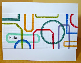
I have a card today for this week's Retro Sketches #16. When I first saw this sketch, I admit to being a little confused and intimidated. But, after a bit of thinking, I came up with something.
What I took away from the sketch was lots of different shapes and textures across the middle of the card. Kasia's example inspired me to go for some color, too. Now, I am a CAS kind of gal, so I decided to use PTI Label Basics to get my shapes, and the Canvas/Linen IP for my texture. I added just a simple sentiment from Modern Basics. All colored inks are PTI: Pure Poppy, Simply Chartreuse, Summer Sunrise, Ocean Tides, Winter Wisteria, Blueberry Sky.
Thanks for Visiting


It is quite a different sketch - I don't know what I would do with it! I love what you came up with, and how you stayed so true to your style :)
ReplyDeleteSo. Cool. Great card on its own (clever use of colour and shape) and great take on the sketch, which is a tricky one!
ReplyDeleteJoyce, this is AWESOME!!! I love the colors and the modern look of the card :)
ReplyDeleteI jus -l-o-v-e this! Love the idea; love the look. Will be case'ing this for sure!
ReplyDeleteJoyce, this is one of my favorites of all the cards you've posted! So creative and artsy:)
ReplyDeleteJust saw your card on retro sketches looking at how people had managed to do a card from this sketch-your card stood out-it is a fantastic take on the sketch. I love Cas cards too so this is a real inspiration-not sure I will manage it this week though!
ReplyDeleteThis is great - definitely a great take on a really difficult sketch! M x
ReplyDeleteWhat a great card Joyce. I would have never thought about using that set, but it looks amazing! I agree with JJ, creative and artsy.
ReplyDeleteCool take on the sketch, Joyce! How great to see you using your Label Basics set! ;)
ReplyDeleteLove what you came up with Joyce. I think I would have a hard time with that one , maybe. You're so creative to come up with this card and I love all the colors and the way you rotated the stamps.
ReplyDeleteJoyce this is fantastic! It's so graphic and bold—love the CAS interpretation!!! So glad you decided to tackle this challenging sketch! :)
ReplyDeleteLove the way you used the frames :)
ReplyDeleteLove this, Joyce!!! I have never thought of using this set that way. Now that I have it, I've got to try it! Thanks for the inspiration!
ReplyDeleteJoyce,
ReplyDeleteYou did an amazing job with this sketch. I found it difficult to interpret. Love the set you chose as well as the colors.
Joyce, super cool card! i love how you used this stamp set with all these colors! i must keep this in mind - thanks for the inspiration!
ReplyDeleteFantastic card, love the idea and your composition is perfect! Thank you for playing along at RetroSketches ; )
ReplyDeleteLove your take on the sketch.
ReplyDeleteI think your take on the sketch is super. When I saw the thumbnail veiws this really popped off the screen. Love it - clean, simple, geometric - sort of perfect!
ReplyDeleteThat's a great interpretation of a very difficult sketch!
ReplyDeleteI love this!! It's officially my new favourite card of yours! It's so fu and graphic and colourful and the sentiment is perfectly placed. I would have struggled forever with where to put it but you nailed it. :)
ReplyDeleteThis is so cool!
ReplyDeleteThis is an ingenious use of these frame stamps, and the colours you used reminds me of the map of the London Underground!
ReplyDeleteJoyce...great take on this challenge! I love the shapes you stamped in all of these beautiful colors, a very striking card.
ReplyDeleteLove this layout Joyce! You worked out this sketch perfectly! Thanks for playing along!!
ReplyDeleteJust found your blog. Like your style. Whilst looking around I found a new stamp company - MSS - so thanks for that, as well as the inspiration.
ReplyDeleteJenny
I love how you used the sketch joyce... all those colourful frames really pack a punch on that strip.
ReplyDeleteJenny x