Pages

Saturday, May 31, 2014

The 12 Kits of Occasions: May 2014


Happy Saturday.  I have been anticipating this day for a while now--it is time for the big reveal posting for our 12 Kits of Occasions group.  I was the hostess this month, and the theme I was assigned was 'In the Navy'--all things nautical and masculine.  I found some fabulous nautical themed paper from Fancy Pants, and built my kit around it.  It's big on primary colors, and I thought it would work well for Father's Day and masculine cards in general.

Here is a picture Kara took of the kit I sent out.  She makes it look so good.


I made 9 cards before I ran out of time.  I'm going to get right to the pictures, because there is a lot to look at here, and then all the other designers to hop to.

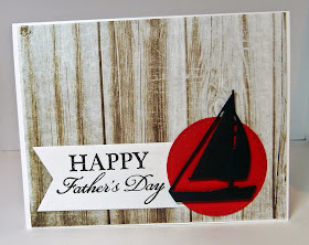
First I tried to get my Father's Day cards made.


I couldn't decide where to put a sentiment on this one, so I will just stamp something inside when I send the card out.


After the Father's Day cards were all done, I made a couple of Thank You cards.


Well, that's it for me.  I cannot wait to see what everyone else has done with my kit.  I think that the reveal day is always most exciting to me when it is my kit.  It is always so interesting to see what people make with the goodies I sent out.  A little nerve wracking as well.  If you would like to see the supplies list for this kit, please click here.

We are so lucky this month to have two fabulous guest designers, Lindsey and Sherrie.  Please make sure to visit them, too

Here is a list of all the other members of our 12 Kits of Occasions group.  Please visit them and see what they have created with my May kit.


Joyce (that's me)


Special Guest Designers: Lindsey and Sherrie

 
 Thanks for Visiting

Thursday, May 29, 2014

Thank You and Sending Well Wishes


My first card today uses the debossing stamped images technique demonstrated by Dawn in this week's Make it Monday #166.  I chose to work with Fancy Folk Art after seeing Lee Anne's beautiful card here.  The debossing technique works better using bigger dies that don't need to be run through the Big Shot multiple times.  


Here is a close up to show more of the debossing and the Stickes, too.


I am also entering this card at Addicted to CAS #39:Texture  Simon Says Stamp Monday Artsy Stamping Fun, and Simon Says Wednesday Anything Goes.


My next card uses ColourQ #243 colors and the sketch at CAS(E) this Sketch #78.  I am also entering it at Less is More #173 to use a die cut--I actually used several Memory Box Ribbon Candy Border die cuts, Simon Says Stamp Monday Artsy Stamping Fun and Simon Says Wednesday Anything Goes. 


As soon as I saw the sketch at CAS(E) this Sketch, I knew that I would use my Ribbon Candy Border die.  I cut the die out of all four colors and just nested them together. My sentiment is from Wet Paint.


Thanks for Visiting

Wednesday, May 28, 2014

I Love New York City


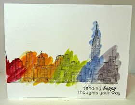
In my attempt to use my Altnew Sketchy Cities America to play along at Retro Sketches this week, I ended up with 3 cards.  None of them are really true to the sketch, but I will post the the one that came closest.  I was aiming for something that had a big circle (oval) cut out, with selective water coloring.  I had a lot of trouble pulling this idea off.


This is the last card I made, and it is closest to the idea that was floating around in my head.  I used PTI reinkers and a water brush to color the buildings, and then topped it all with Wink of Stella.  The oval is cut with Lil Inker Stitched Oval dies and popped up with foam tape.


Here are my other two attempts.  


This is the one I am entering at Retro Sketches, as it is the closest to the sketch.  (Is it close enough?)


I am (apparently) obsessed with city and skyline stamps, so I am happy I ended up with three cards, even though my attempt to follow the sketch this week was a bit of a fail.


Thanks for Visiting

Tuesday, May 27, 2014

CASology Week #97: Bee


Hello and happy Tuesday.   Wow--you guys really went to town on last week's cue word of flower.  We had so many stunning entries--it was really difficult to choose the winners.

It's time for new challenge at CASology. Our cue word this week is BEE.  Now, do NOT do what I did and run screaming because you hate bees and don't think you have any bee stamps.  Do not even think of calling in sick to the challenge.  I know that bees are really good for the environment and the garden.  I have even seen lots and lots of cute bee stamps.  But, what can I say--I just don't like bees (or honey either).

Anyway, it turns out that I do have a bee stamp after all, and it is kind of a cute bee--provided it stays on my card and doesn't buzz around and sting me.  This little cutie pie bee was hiding in my PTI Tiny Treats Birthday set.  You will probably not be surprised to learn that this is the first time I have ever inked him up.


I stamped my bees on a stitched circle die cut, and colored them in with a Distress Marker.  No particular reason to choose Distress other than that I just got it and wanted to try it out.  I made a background out of a hexagon die cut adhered to a white card base, and randomly filled in some of the hexagons.  In order to make the yellow hexagons match the yellow on the bee, I just colored the white hexagon die cut with the same marker I used for the bee.

I have to say that this bee looks friendly and cute--not as scary as some of the real live bees who swarm around outside.

Now, it is your turn.  What are your feelings and opinions about bees?  Love 'em?  Do you have any cute bee stamps you are dying to bust out?   Have some fun with the cue word BEE, and then please link up your creation on the CASology blog by Monday 6/2 at noon (CST).
Since CASology is a Clean And Simple challenge, I thought it would be helpful to review some things to keep in mind when creating a CAS design:
1.  One main image
2.  Lots of open space (uncluttered)

3.  Limited layers & embellishments
4.  Quick & easy to recreate
 
You can see that my card meets all 4 criteria above.
 
So, what do you think of when you see the word BEE?
 
Check out the beautiful designs from the CASology Design Team members and see how they were inspired by BEE.  Then, please play along and link your creation to the CASology blog by Monday 6/2 at noon (CST).  

Don't forget to keep your card Clean and Simple.
 

Monday, May 26, 2014

Missing You cards for Operation Write Home


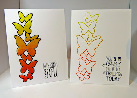
I have a quick post for today in honor of Memorial Day in the US.  I have a few more cards for Operation Write Home using the SSS Butterfly Drift die.  I just got an older Verve stamp set, Always on My Mind, and it has the best fonts and sentiments for missing you cards--so I made a few more butterfly missing you cards.


These cards were inspired by a color blocked ombre pattern I saw on a bag at the gym the other day.  I sponged distress ink on to a piece of white card stock--yellow through orange to red.  Then, I cut with the butterfly drift die twice, flipping the die over so one cut started dark and went to light and the other cut started light and went to dark.  I was able to make two cards with each die cut by using the border and butterflies separately.  


Thanks for Visiting
Sunday, May 25, 2014

PTI May 2014 Blog Hop


I really love the Aqua Mist and Melon Berry color combo that is the theme of this month's PTI blog hop.  I was inspired to make 6 cards, and I'm sure I could have made more if my May order had arrived in time and also if there were more hours in the day.

I will start with the card that I think might be my favorite--it combines roses from The Sweet Life with Background Basics Medallions and a sentiment from Ruby Rose.


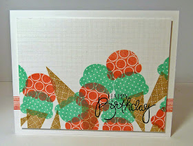
All those popsicle cards shown during the last count down inspired me to take out my ice cream cones, and I was inspired by one of Maile's cards for this card using Sweet as Can Be.


I used an inlaid die cut technique on this card, overlapping Aqua Mist and Melon Berry beautiful bloom die cut flowers.


My next two cards are inspired by Susan over at Simplicity--I don't remember the exact post, but she talked about making 'missing you' cards where the design included something missing.  I can't remember all the details, but they inspired me to make the following pair of cards.  I used a butterfly die from Simon Says Stamp that I can't seem to get enough of and a sentiment from Botanical Silhouettes.


I made a pair, because  I needed to die cut one set of butterflies in each color, but only used half of them, so I made another card to use the other half.  These cards are going to Operation Write Home, as they are apparently always in great need of 'miss you' type cards.

My last card might be my 2nd favorite of the bunch--or maybe it is my first favorite--anyway--I used Betsy's technique from this week's Make it Monday #165:  Artsy Watercolor Backgrounds. 


I dabbed some circular sponges into the ink and then stamped them randomly over a small angled piece of white card stock.  Then, I went over them with a water brush and dried it with my heat gun.  I love the soft and dreamy look that results.  The sentiment is from Keep it Simple Birthday.  I love the medium sized birthday sentiments in this set.

Well, that's it for me today.  I know I am going to see so many amazing cards today--if I had gotten my order in time, I would have used those new butterflies, and I expect to see that lots of people did.


Thanks for Visiting

Saturday, May 24, 2014

Happy Birthday


I've got a card today for three challenges--Serendipity Stamps SSCB #31: Flowers,  Seize the Birthday 'Tag You're it' topping, and Simon Says Monday Botanical.


I started with two small pieces of white card stock.  I used a water brush and reinkers to paint one piece and stamped the second piece with a Serendipity flower stamp.  I used the Lil Inkers Anytime Tags to cut both pieces, and attached them with foam tape.  I used Copic markers to color only one flower, and then attached a little sentiment tag.  Some Wink of Stella and Glossy Accents on the flower, and that's it.  I also impressed the card base with the woodgrain IP for a bit more texture.


Thanks for Visiting

Thursday, May 22, 2014

Congratulations and Birthday Cards


I have a card for this week's Make it Monday #165:  Artsy Watercolor Backgrounds.  Watercoloring is so trendy now, and I really like how easy it is.  I used some Ranger water color paper and Mum's the Word stamps in Berry Sorbet, Lavender Moon, Harvest Gold and Simply Chartreuse ink.  I stamped my sentiment in Versafine Onyx Black after everything was dry.  I am also entering this card at Less is More #172, where the theme is Flowers, and Simon Says Monday where the challenge is Botanical.


I have 4 cards using the color scheme at this week's ColourQ cQc #242.  What--why 4 cards?  Well, I wanted to play around with these colors first using Copic markers and then distress inks.  I used my PTI Text Block Birthday die, and because I cannot bear to waste a die cut, each method ends up with two cards.

First up are my cards using Distress Inks.  I used 4 colors and sponged them on a piece of white card stock, blending where the colors met.  Then, I ran that piece through my Xyron machine, before cutting it with the Text Block Die.  I also took a plain piece of white card stock, ran it through the Xyron machine and then cut it with the die.  

The cards are made by adhering the die cut sentiment piece to a card base, and then filling in the bits from one die cut on to the card base with the other die cut.


I used a similar method for my cards using Copic markers.  I used 4 markers and colored a piece of white card stock with them, overlapping the colors where they met.  Then, I ran that piece through my Xyron machine, before cutting it with the Text Block Die.  I also took a plain piece of white card stock, ran it through the Xyron machine and then cut it with the die.  


 It is very hard to tell the difference between the two sets of cards in these photos, but it is a little more obvious in person.  The ones with distress inks have more blended flow between the colors.  It was fun to play around with these colors, and now I have 4 birthday cards to add to my stash.


In this side by side comparison, you can see the Copic card on the left and the Distress ink card on the right.  If you look closely, you can see how the colors are blended where they meet.

I am also entering these cards at Seize the Birthday--(no toppings--anything goes).


Thanks for Visiting