Pages

Monday, March 31, 2014

The 12 Kits of Occasions: March 2014


Today is the last day in March and time to post our projects for the 12 Kits of Occasions.  Our hostess this month is Kelly, and she sent the most wonderful package of goodies--all themed for spring and Easter.  In San Diego, Oour March came in like a lamb and is leaving like one, too, so I am all ready to craft for spring.  Take a look at what Kelly sent out:  

Photo courtesy of Kara


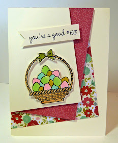
Wouldn't you just love to dive in and create?  Well, that is just what I did.  I will get right to my pictures, since there is a lot to see.  I'll start with my favorite of the bunch.


That's it for me this month.  I am interested to see what everyone else did.  I still do have quite a few things left over that I can use for CASE-ing.  Thank you so very much, Kelly, for sending such a wonderful kit.  

And, there's more.  We have a special guest designer this month, Karen from Crraftymama's Crafting Kitchen.
 
Please stop by our 12 Kits of Occasions blog page, our Facebook Page, our Pinterest page, and also visit all the other members of our 12 Kits of Occasions group.


Joyce (that's me)


Special Guest Designer: Karen


Thanks for Visiting

Sunday, March 30, 2014

Retro Sketches and a ColourQ Card Set


Happy Sunday.  I hope everyone is having a nice weekend.  Things are pretty sunny and quiet here, as college testing and research project dates loom.

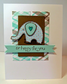
I have a card for this week's Retro Sketches rs#108 challenge--and I am using a brand new to me Hero Arts baby set called New Baby.


I chose a gender-neutral color scheme of Aqua Mist, Hawaiian Shores and SU Baked Brown Sugar.  I paper pieced one of my favorite images from this set--the little elephant, and started with Happy Spots paper.  The colors look off in this photo, but the elephant is actually Aqua Mist, Dark Chocolate, and White.  I made my own plaid paper for the bottom layer using WMS Offbeat Backgrounds.  The heart on the elephant's ear is Hawaiian Shores coated with lots of Glossy Accents.


I guess you could say that I really loved this week's ColourQ cQc #234 colors, since I am back again with an entire card set made with those colors.  I used one of the masking techniques taught by Kara in the most recent on line card class.


I was able to create one mask and use it three ways to make three cards.  I did this twice--once with butterflies, and once with mini flowers.


The following three cards use the smallest butterflies from Beautiful Butterflies.  First, I used the negative piece and stamped around the inside border.


Then, I used the die cut butterfly as a mask, and stamped around the outer edge.


Last, I used the negative mask again, and stamped in the entire space.  I started out by stamping around the outer edge, because it is important that the entire outer border is stamped--that is what will give your stamped shape its definition.  Then, I just randomly filled in the center.


Here are the three butterfly cards together.  I also made lined envelopes for the set.  Thanks to this post by Joan, I was inspired to use Distressed Stripes to make matching envelope liners.  I don't know why I never thought of it before, but I love the idea of stripes in matching colors, rather than trying to replicate the pattern on the card.  I embossed all three cards first with the largest Lil Inkers Stitched Rectangle die and then with the Burlap Impression Plate. Impossible to see in the photos, but all the butterflies are coated with Wink of Stella.  


Edited to add:  I am also linking up to a new challenge:  Time Out Challenge #2 where my butterflies fit in with this gorgeous inspiration picture.  (Thanks, Lynn).


Same concept as above for the other three cards in the set, but this grouping uses some of the smaller flower images from Embellished Elegance.


All three of these cards were also embossed with the largest Lil Inkers Stitched Rectangle die and then with the Woodgrain Impression Plate, then coated with Wink of Stella. The sentiments are from a variety of sets.  

I knew which types of sentiments I wanted to include in this set, and just flipped through my sentiment binder looking for versions that would fit in the space and that I thought would look good.  Occasions like this make me really appreciate the time I have invested in my Sentiment Binder.

I used kraft packaging paper, some twine and a die cut butterfly (dolled up with Wink of Stella and Stickles) to create a very simple packaging.


Thanks for Visiting

Thursday, March 27, 2014

Make it Monday, Colour Me and Seize the Birthday


I made two cards for this week's Make it Monday #157 DIY Coverplates.  This is an interesting technique, but I have to say that I don't think I will ever complain that a $16 cover plate is too expensive.  It's easy but error prone to try to do it yourself--at least in my experience.  

I used Get to the Point dies for both of my cards.  For my first card, I put a piece of patterned paper from Basic Gray Kneehighs under my die cut card stock.  I got that idea from this gorgeous card made by Diana.


I added a sentiment to the inside, and the last remaining bit of that patterned paper.


I used Laurie's Card Hanger Die to attach the card to a gift bag.


I used the colors of this week's Colour Me #13 for my next card, and a different die from Get to the Point.  In Betsy's video, she suggests saving all the pieces that are die cut if you are not going to stamp inside the negative spaces.  Since I don't have the Get to the Point stamps, I adhered my die cut panel with foam tape, and then reinserted all the die cut pieces after stamping them with Background Basics Herringbone.  

My panel is cut along a diagonal at about the half way point.  That is because there were some unmentionable things that happened at the top, and I didn't want to start over.  I kind of like the partial look, though, and it gave me a good place to stamp my sentiment.


I am also going to link both of these up at Seize the Birthday.  It's been far too long since I played over there.


Thanks for Visiting

Tuesday, March 25, 2014

PTI Blog Hop Take 2, The Card Concept and ColourQ


I am sneaking in with yet another post for today--a second card for the PTI March Blog Hop, inspired by this tutorial on Damask Love, the photo at The Card Concept #6, and this week's ColourQ #234.

I used a partial die cutting technique to cut part of a Mum's the Word flower out of the front of my card, then stamped the sentiment on the outside, and stamped a very colorful inside.  This is incredibly easy to do, but I have to admit I either smudged or didn't line things up or messed up in some other way, and this card is my 5th attempt.  When I smudged the inside of what I had determined to be the final card, I used a little sequin stamp from this Mama Elephant set, and we will just pretend that I wanted sequins inside and outside my card.  Those sequins are coated with glossy accents--and are the 'high gloss' for the PTI blog hop.


Outside:


Inside:


Thanks for Visiting

PTI March 2014 Blog Hop


I waited until the last minute to make and write up my PTI blog hop card.  I don't know why, but I'll try to be quick about it.

Since the theme is High Gloss, I decided to use my UTEE--it made my card difficult to photograph, but it is very glossy in person.


My card layout was inspired by this card by Amy that I saw last night.  I die cut two flowers from Doodlie Do and stamped them with Versafine Onyx Black.  Then, I turned the stamp upside down, and used the back to stamp color onto the stamped image (too lazy to color, but this is so easy).  I used SU Strawberry Slush and Crisp Cantaloupe.  I did the same thing with the leaves, using Limeade Ice ink.  Then, I covered both flowers with Versamagic and embossed with 3 coats of UTEE.  The flowers are very stiff and shiny in person.

There's a lot to see today, so I won't keep you long.


Thanks for Visiting

CASology Week #88: Lucky


It's time for another CASology challenge.  This week, our cue word is LUCKY.  What do you think of when you see the word LUCKY?   I looked through my supplies and then remembered that I had a 'lucky' word die that I have never used.  It came with 'happy', which is the word I wanted, and I forgot all about lucky.  I was lucky I remembered about that die.  (ba dum bum)  Have some fun with this cue word, and then please link up your creation on the CASology blog by Monday 3/31 at noon (CST).


I adhered my white die cut 'lucky' onto a piece of Pure Poppy, cut with Lil Inker's On the Diagonal die.  I also embossed my card base with the largest Lil Inker's Stitched Rectangle die.  I love the look of those faux stitches.  It gives the white space just a little something.  I added a trio of flowers and some leaves from Bigger Blooms, and finished the sentiment with a stamp from Wonderful Words Additions.

Since CASology is a Clean And Simple challenge, I thought it would be helpful to review some things to keep in mind when creating a CAS design:


1.  One main image
2.  Lots of open space (uncluttered)
3.  Limited layers & embellishments
4.  Quick & easy to recreate
 
You can see that my card meets all 4 criteria above.
 
 So, what do you think of when you see the word LUCKY?  

Check out the beautiful designs from the CASology Design Team members and see how they were inspired by LUCKY.  Then, please play along and link your creation to the CASology blog by Monday 3/31 at noon (CST) 
 
Don't forget to keep your card Clean and Simple.

http://casology.blogspot.com/

Joyce Mehrberg (that's me)

And our guest designer this week, Karen.
 
 
Thanks for Visiting

Sunday, March 23, 2014

Colour Me, Color Throwdown, Muse, Simon Says, and Homework


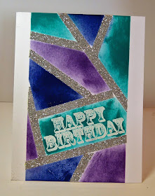
Hello and happy Sunday.  I am popping in quickly to share three cards I have made over the past few days.  First up is a card for my Clean and Simple homework, using a variation of the technique from Day 6 and the colors from Colour Me #12.  I used Distress inks in the closest colors I had. I masked random sections off with 1/3 inch post it tape, and then sponged distress inks into the sections.  It was a good example to me of how well those Distress inks blend, because I masked adjacent sections with post its, and ended up inadvertently blending in colors from previous sections.


Now I will show you my first attempt at this technique.  I was inspired to use this week's Color Throw Down colors when I saw Jacquie use them.  I forgot that I had post it tape, and used score tape to mark off my sections.  All fine, until I realized I would need to stick something onto that score tape.  The only thing I could think of was glitter--I think this card is a bit much, and prefer my first attempt.


I have not played at Muse in a long time, but I've been thinking about this fabulous card all week, and finally came up with an idea.  I have an eyeglass die from The Cat's Pajamas that I have never used.  I decided to play off the rows of colored die cuts on this card, using my eye glasses die.


I think this would make a cute birthday card for anyone who wears glasses.  The top strip is coated with Wink of Stella.


I will be entering the first and third card in this week's Simon Says Wednesday Glitter It challenge.


Thanks for Visiting